|


|

|
Background
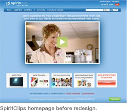
The original site design in 2009 offered one view of a free sample film with links below in small, static boxes and text. The homepage was not dynamic or SEO optimized. The large thumbnail showed “Sally” (Nancy Travis) looking down with a large green play button obscuring her face. The look and feel was corporate rather than dramatically inviting. Only one free film was presented, giving the impression the site lacked content.
The goal of the redesign was to increase memberships, especially premium, by providing a more attractive, functional, enjoyable user experience.
Highlights:
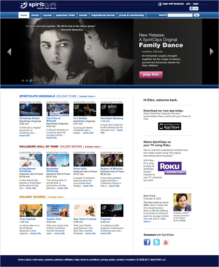
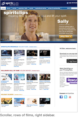
- Designed and implemented a scroller (first in Flash, then switched to HTML5 for mobile compatibility) that better showcased the many new original films and partner content such as Hallmark Hall of Fame feature-length films that SpiritClips began offering.
- Created a new join path.
- Designed new “filmcard” and “simple send” film processes.
- Created video streaming areas for new content partners such as Hallmark Hall of Fame, Odessey Networks, and TED Talks.
- User testing indicated viewers did not think SpiritClips offered much content. To correct this perception we added seven horizontal rows of selections (more than pictured here) and a forth column on the right to highlight new features such as the iPad/iPhone app and the new Roku channel. View user tests sample »
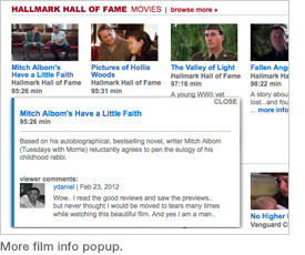
- Designed a popup to show more film info with links to keywords, comments and user profiles. This increased SEO and traffic into the site.
- Added links to the new Facebook page we created, as well as our Twitter and YouTube channels. SpiritCliips “likes” on Facebook subsequently went from less than 100 to over 4,000 and commenting/sharing increased from 0/day to 200 – 400/day.
Process
We kept on track by utilizing the Agile/SCRUM methodology. With a very small web team (2-4 in-house staff), several off-site developers, and an innovative, deadline-driven environment with multiple projects, using Agile enabled us to get a lot done quickly and efficiently.
Initially we developed personas to understand our users. We looked at user surveys, user profiles on the site, discussions with team members, user emails, analytics, current and desired target market, and the competition. From this we compiled profiles of seven user types that formed the foundation for the design going forward. View personas »
Technical Skills
UX, UI, Concepting, Wireframing, Visual Design, Photoshop, InDesign, Illustrator, Mock-Ups, Dreamweaver, Programming in HTML, CSS, SVN, and Copywriting.
Wireframes
Result
As a result of the redesign SpiritClips free membership grew by 500% over 2 years and premium membership tripled. SpiritClips added over 10 new content providers, most importantly Hallmark Hall of Fame, as well as over 50 original SpiritClips films. On March 31, 2012, SpiritClips was acquired by the Hallmark Company, a successful result for this start-up. View on TechCrunch »
|

