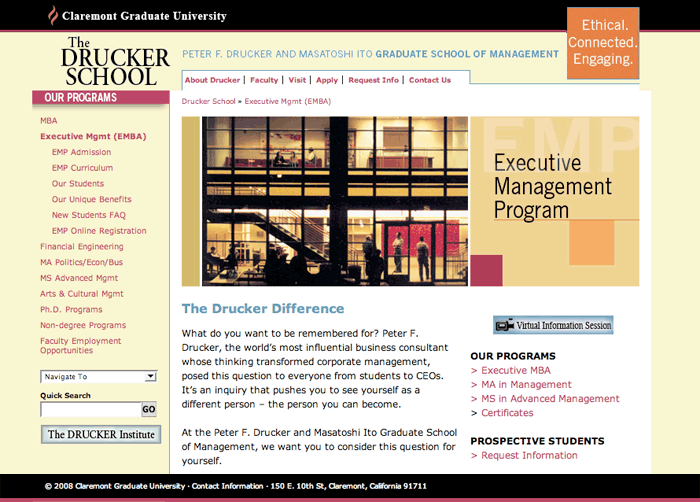
The Drucker School reflects his philosophy of “management as an art as well as a science”. Unfortunately, the website did not convey their mission and commitment to excellence.
Instead, the interface design, confined by the limits of the content management system, was rudimentary and sporadically updated. The economic savings of this system did not mitigate against the lost opportunities of a well designed site.
Our first task was to show the value of good design. Our competitor analysis proved how much more visually exciting and informative other top university sites were. This gave them the motivation to proceed.
This specifications document [pdf] we created shows in detail the personas, wireframes, flow charts and initial designs that grew into the current dynamic, easily updatable site.
The Result
A year later, the Drucker School ranked among the nation’s top ten business schools in faculty and classroom experience by the Princeton Review.
The interface reflects the strategic thinking that made a winning case for a new user experience. The site now visually and functionally conveys the values of the institution cited in the Review. It reinforces the experience of attending Drucker School and makes it easy for current and potential students to find the information they need.
Technical Skills
UX, UI, concepts, research, branding, comps, wireframes, visuals, programming into CMS


